Urban Transportation Planning Overviews based on Citi Bike System Analysis
Today Jennifer Sta. Ines has shared plenty information on Citi-Bike, the famous public bicycle system in New York City. We have obtained some valuable information of the developments and managements for Citi-Bike from the perspective of spatial data analytics. I'm quite interested in this topic because I did explore the Citi-Bike data before in other project. Combined Jennifer's presentation with my own experience, I've got following reflections and inspirations.
First of all, I am actually not very clear about how Citi-Bike allocate the stations at the very beginning, but the allocations are keeping adjusting according to the data recording each trip of each bicycle. For example, the most frequent used stations and most popular routes can be figured out through data mining. Citi-Bike can increase docks and bicycles on popular sites in order to guarantee the bicycles supply, and decrease docks and bicycles on least popular sites in order to optimize the resource allocation. For instance, there is a summary of most popular ten stations shown as follows.
First of all, I am actually not very clear about how Citi-Bike allocate the stations at the very beginning, but the allocations are keeping adjusting according to the data recording each trip of each bicycle. For example, the most frequent used stations and most popular routes can be figured out through data mining. Citi-Bike can increase docks and bicycles on popular sites in order to guarantee the bicycles supply, and decrease docks and bicycles on least popular sites in order to optimize the resource allocation. For instance, there is a summary of most popular ten stations shown as follows.
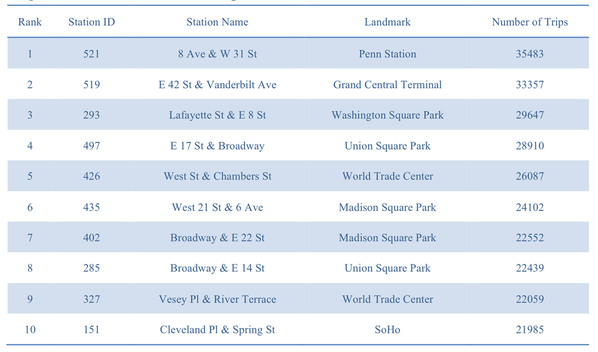
The chart above is figured out based on a specified time period in 2014. We can draw clearly conclusions from it, the most popular stations are located near commuting spot like Penn Stations and PTA, or public parks, or famous landmarks. These results show the demand condition of each station which comes to be important reference for the Citi-Bike corporate.
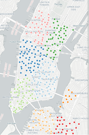
Secondly, the focus should be the route of each trip, the route data can provide information of the Citi-Bike flows. This means, find out users usually move from which place to which place. Based on clustering on a map, all the stations are divided into different clusters, and relationship between different clusters can be simulated by Markov Matrix. This can provide adjustment advice on the regional level. The sample clustering map is shown below.
Secondly, the focus should be the route of each trip, the route data can provide information of the Citi-Bike flows. This means, find out users usually move from which place to which place. Based on clustering on a map, all the stations are divided into different clusters, and relationship between different clusters can be simulated by Markov Matrix. This can provide adjustment advice on the regional level. The sample clustering map is shown below.
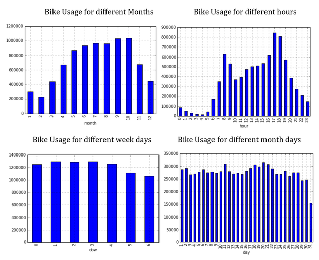
Last but not least, there should be other discoveries just like summarizing the users' characteristics and using preferences. Pretty much crucial information can be figured out to help advanced analysis. Take a look at visualizations listed below.
QGIS: Smart Tool Helping Urban Transportation Planning
After the lecture, we had the lab session on getting familiar with using QGIS, what I feel about it is that there are clear and logistic structure inside QGIS. For basic shape file input and spatial data input, it is not very hard to do commands. So what I did for the QGIS application during lab is mapping some 311 complaints data on the map of New York City. The map has shown the complaints about "street light", "street sign" and "traffic signal", they are in different colors.
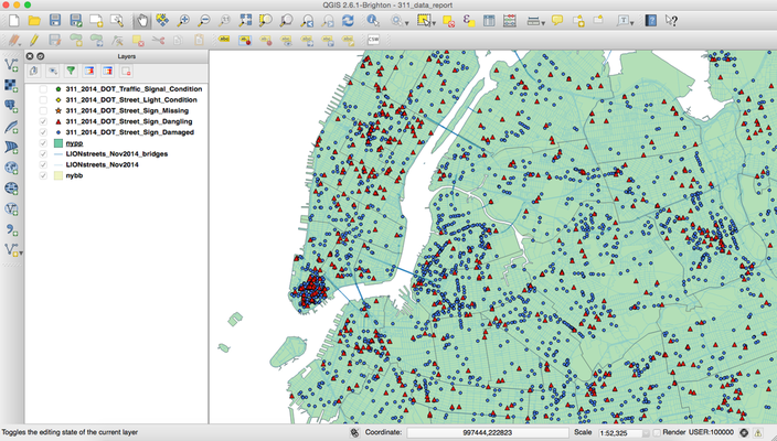
Also, different shape files will allow you to explore different goals. For example, to classify complaints according to regions, I can input different shape files of Police Administration Area and ZIP area.
Thoughts and Evaluation on My Project So Far
To take advantage of today's gains, I think the most helpful thing for is the application of QGIS in future phase of my project, when I am able to get all the data from each area in New York City, QGIS or other similar tool is a good choice for me to do visualizations. The original concept of my project is "pace speed map", so the ideal output of the project should be a map with clear and direct illustrations. As for the foresights for midterm and final presentations, I've got both plans and challenges, also there exist some limitations and need to be considered seriously.
Challenges & Limitations
Next several weeks before the midterm are crucial for my project, I have to communicate with Arlene and figure out how to address these challenges. And also start implementing my project.
Challenges & Limitations
- Which sensor is the best choice for me? (a good choice should be saving time, functioning precisely and efficiently)
- The design for sample areas? (because the limited time does not allow me to make it for the whole New York City, I have to pick up typical sample areas. The challenges should be how many and which ones to select)
- Too many variables for the project. (when I collect data, I have to consider different variables which influence the result in different ways. For examples, the weather, time period, weekday or weekends...)
- Limited time. (how to collect data in efficient ways?)
Next several weeks before the midterm are crucial for my project, I have to communicate with Arlene and figure out how to address these challenges. And also start implementing my project.
